Fcode

Issue
How to ensure a smooth adoption of a biometric card prototype while ensuring a user-friendly experience during self-registration via smartphone and connected reader?
The challenge: overcoming usability barriers for end users (both individuals and banks).
My Role
UX designer
Date
2024
Client
Idemia
Target
Banks
Project objective
Analyze the friction in the home registration process and propose concrete improvements, tested with banking targets and end users. The challenge: to facilitate understanding of the product and encourage its adoption by partner banks.
About Fcode
Fcode is a biometric card developed by Idemia, incorporating a fingerprint sensor for secure payments.
Self-registration at home was a major friction point, hindering its adoption by banks.
The product targets a B2B2C use, aimed at banks and their customers.
Added value: A reliable biometric system, frictionless, that enhances security and the user experience during transactions.
Introspection
Fcode
My role
Guided by a senior UX/UI designer, I structured and conducted guerrilla user tests to evaluate the onboarding experience of the Fcode card.
My role involved:
Writing hypotheses and test scenarios,
Interacting with users to gather their feedback,
Synthesizing the results to inform the recommendations.
This work was part of an agile process, under the supervision of an experienced designer.
What I have learned
Conduct guerrilla testing in real conditions,
Adapt my posture according to the maturity level of users,
Structure relevant feedback based on quick tests,
Collaborate with a senior UX to refine analyses and recommendations.
Highlights
Implementation of quick but targeted tests, despite a limited panel,
Ability to adapt the testing protocol in real-time,
Good synthesis skills to bring out areas for improvement.
Possible improvements
With more time, I would have liked to strengthen the UX integration at each stage, refine the wireframes based on feedback, and explore further the customization of interfaces according to banking targets.
Testing protocol
Fcode
In Brief!
This step allowed us to structure the UX approach around registering the Fcode card by creating a precise protocol to identify pain points, ensure coherence in the journeys, and validate the prototype.
User tests
Fcode
In Brief!
A/B tests were conducted to optimize card registration. This step validated the most effective visual formats to guide the user.
The tests
Context
Many users were stuck at the insertion step.
The team wanted to test two visual supports to accompany the action clearly.
Preparation for A/B testing
Organization of a workshop with the Fcode team to determine the elements to test. The objective was to simplify the user journey, particularly the card insertion phase and the understanding of the payment process.
The two variations tested were:
Variation A: Video flow, to guide users through each step with a dynamic presentation.
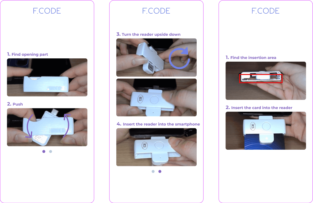
Variation B: Image flow, to simplify visual instructions and clarify each step.

Test results
In conclusion, the tests identified the best practices to guide users throughout the process, particularly by adjusting visual content according to their needs.
The results showed marked differences between the two variations:
A - Flow videos
Best dynamical representation of the action,
Less accessible: requires a player, subtitles, voice-over,
Heavier in eco-design and production cost.

B - Flow images
Allows you to progress at your own pace,
Lighter, eco-designed,
Less interpretable if the image is blurry or poorly framed.
Results
Fcode
In Brief!
A/B tests showed clear differences between the two formats. Each version has its advantages, but the team decided in favor of images for reasons of clarity, accessibility, and eco-design.
Key results
Organization of results
Individual analysis of each test,
Cross synthesis,
Collective conclusion.
Final choice
The flow B (images) was chosen for its:
Ease of understanding,
Accessibility,
Technical lightness.